Back to blog


Table of Contents
To measure the success of a well-designed landing page, most marketers consider conversion rate as the top metric. Yet, what could stand in the way between your site’s visitor and their all-important conversion? It’s a little word that has big power: Form.
When it comes to creating an effective landing page, it’s all about getting a website visitor to fill out a form with their email address. To do this, you need a curated and clear form on your landing page.
A landing page form is the way to take your relationship with website visitors to the next level. Forms are a digital bridge of trust between your company and a website visitor, and they play a huge role in facilitating higher conversion rates. Most importantly, how you design your form affects the overall user experience of your website.
A landing page form is the way to take your relationship with website visitors to the next level. Forms are a digital bridge of trust between your company and a website visitor, and they play a huge role in facilitating higher conversion rates. Most importantly, how you design your form affects the overall user experience of your website.
Here’s why forms on landing pages are important:
- 56% of marketers claim that form logic plays a role in website performance. “Research shows that form questions need to follow certain logic to make customers want to fill them out and sign up.”
- 46% of marketers believe that form layout has a big impact on conversion rates.
- 11 is the average number of input fields (see below) on landing pages. By reducing it to four fields, you could see an increase in conversions by 120%.
Based on these stats, your form’s design and layout directly impact whether or not your website visitors will convert on your landing page offer. Because these forms are the final step before conversion, it’s important to create a form that’s easy and straightforward.
Mirabel’s Marketing Manager will explain landing page form best practices and cover what to include in terms of form fields, structure, and landing page design. Ultimately, you’ll learn how to create an effective landing page form and how to ensure an easy, intuitive user experience for your website visitors.
Understanding the Basics of Forms
Before we get into how to optimize your landing page forms for success, it’s important to gain a deeper understanding of the different aspects that make up a landing page form:
- Structure: The structure of your landing page form encompasses how your input fields are ordered, the form’s overall appearance (color, size, white space) and layout, and transitional elements (CTA placement; pop-up, sliding, or stagnant).
- Input Fields: An input field, also known as a form field or field, is the box that a user types in or selects from in order to input information. It’s the individual sections that a user clicks through to fill anything out. Some examples of input fields include text, password, slider, drop-down, and checkbox fields. Without input fields, a form would not be able to capture information from a user. Every form has input fields.
- Field Labels: Field labels “ describe the purpose and function of form elements.” They let your users know what they are submitting within the input fields. For example, if a form asks for your birthday, a field label is the label “month” next to a drop-down menu of listed months.
- Assistance: On some landing pages, companies will include explanations, how-tos, or pop-up tips to assist users in filling out a form. This provides a more fluid, helpful user experience.
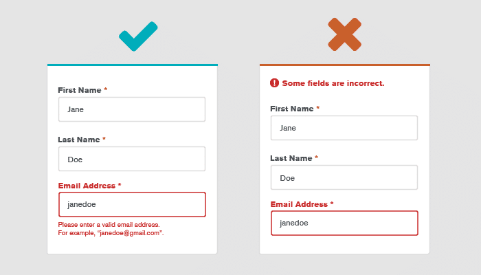
- Validation: A validation field allows you to auto-check whether or not the information filled out by a user is valid. A common example of validation is for email addresses. After a website visitor inputs an email address on a form, the company is automatically able to validate if it’s a real address. They do so by checking the formatting, domain blacklist, DNS lookup, and/or email deliverability. If the email address cannot be validated, the form cannot be submitted even though it’s filled out.
- Call-to-Action: Shortened to CTA or interchanged with an action button, a call-to-action is the button at the end of a form. This button allows the user to submit the form.
- Thank You Message: Once a user properly submits all the necessary information and hits the CTA, a plain-text message is automatically displayed: “Thanks for completing our form.” This is a simpler solution than a full thank you page, and it still lets the user know the form is complete. It may even include next steps for the user to take, such as confirming an email address or signing in to complete registration.
These terms are the basics of how to create a landing page form, and each element allows you to optimize this part of your user’s digital experience. By creating an optimized form, you’re subsequently increasing the conversion rate and turning website visitors into quality leads.
Form Design Best Practices
Now, let’s take a look at the best practices in developing and designing landing page forms.
- Include a clear, straightforward call-to-action.
Every landing page form needs to include a clear, concise CTA at the bottom. A CTA is pivotal in the submission process of a form, and it’s important to know how to create an effective call-to-action. Strong copy, the right color, and the best shape and size all play into how clickable a CTA is.
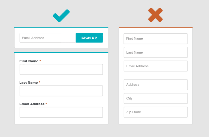
- Limit the number of fields you include when asking for information.
When considering what fields to include in your form, less is always more. Simplicity is key when asking for information; otherwise users feel overwhelmed or like you’re asking for too much or invading their privacy.
When considering what fields to include in your form, less is always more. Simplicity is key when asking for information; otherwise users feel overwhelmed or like you’re asking for too much or invading their privacy.
When developing your form, include only the most important information you need. This is commonly the first name and email address. Some forms ask for the last name or phone number as alternate means of communication. Don’t get greedy when deciding form fields.
- When organizing your fields, start simple and work your way up.
Think of filling out a form like climbing up a hill. Always start your forms with the easiest questions, like first and last name, and work your way up in difficulty
For example, don’t start with a form field of text where a user must type in why they need your product or what their business goals are. That’s time-consuming and unmotivating. It’s also complex and can come off as slightly invasive, like you just want answers without getting to know your user.
Start off easy and nurture your user into filling out the form, so you earn that conversion instead of forcing it.
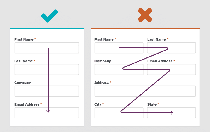
- Use a single column and keep your text aligned to the left.
These simple yet effective form design rules are tried-and-true. A form that features a single column (as opposed to multiple columns) is more user-friendly and elevates the overall user experience. In fact, one study showed that users are able to complete a single-column form 15.4 seconds faster than a form with multiple columns.
Additionally, keeping text aligned to the left also helps with form completion speed. This natural alignment follows the concept of reading left to right. Most users begin at the left, so a left alignment gives the easiest user experience.
- For long forms, include progress bars and status updates.
If your form has too many form fields and/or includes multiple pages, implement a tool like a progress bar that gives users a status update. It shows them how close they are to completing the form. Without a status update, users may start to feel lost, confused, or unmotivated to finish filling out your form. This leads to a lower conversion rate if you don’t follow form design best practices.
- Implement smart forms.
Completing forms has never been faster or easier, thanks to smart technology. Optimize your form for autofill browsers, so users can speed through a form based on past submissions. Another great way to expedite the form completion process is to create smart forms that automatically include a user’s information. Smart forms are ideal for basic fields like location, first and last name, email address, and phone number. These marketing tools are easy to implement on your landing page forms and add to the overall accessibility and ease of your form.
- Give your form a clear title.
This simple form design best practice is often forgotten. The title of your form identifies what your users will gain once they complete your form and hit submit. It should relate to the call-to-action and explain why users should fill the form out.
Without an accurate title, you risk the chance of confusing users and wasting their time. You also risk losing out on conversions and the effort spent creating the landing page and form.
- Reduce typing time and number of clicks for your users.
Whenever possible, limit the amount of typing and clicking users have to do when completing your form. By including images, sliders, and click elements, you’re able to create a more streamlined and enjoyable user experience. This will ultimately lead to higher form completion and conversion rates.
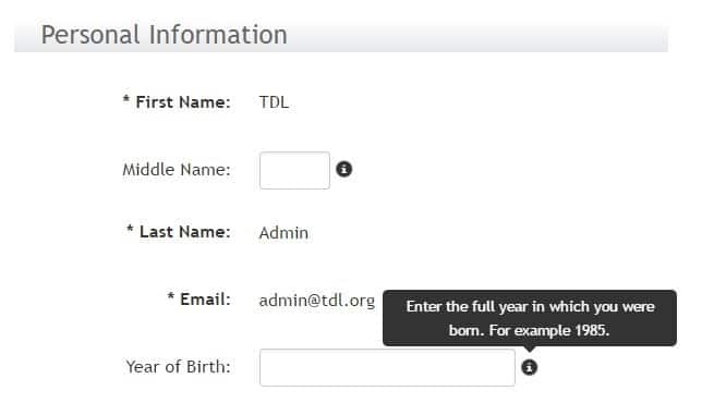
- Use info boxes to address potential questions.
Have you ever seen the small circle with a cursive “i” inside? If you hover over it, it usually flashes a box giving a relevant explanation. These info boxes are common for forms with fields that may arouse questions. Some fields may need a bit of clarification, and info boxes are a great solution. Otherwise, if a user doesn’t understand, they might ditch the form altogether.
These info boxes provide an opportunity to position yourself as a helpful product or service, nurturing the user through an easy experience. This allows the user to build trust and gain more comfortability in sharing their information.
- When using checkboxes, allow for multiple options.
Allow for multiple choice and/or open fields when using checkboxes in forms. This is best practice for questions that can have more than one answer. This is common for questions regarding ethnicity, which is data that should be collected sensitively, and survey-type forms.
The Perfect Form-ula
Creating the perfect form design for your landing pages takes time and testing. (A/B testing landing pages with different forms is a great marketing strategy.) These marketing tips and tricks are a few of the most important ways to make your form stand out amongst the crowd.
When designing forms for landing pages, it’s all about creating the most user-friendly, easy experience for your website visitors so they keep coming back. Conversion and retention are the goals! Following these form design best practices will get you even closer to securing higher conversion rates and help you reach your overall marketing goals.